The war in Ukraine (2022) made me realize my assumptions about wars and conflicts were shallow. My self-reflections are twofold. First, I was simply innocent to have thought that there would be no more physical aggressions in the world that would culminate in war. In addition, I was unaware of the many other wars and conflicts that have broken out before. Why is everyone more concerned about this war in Europe? What is war, and what is not war? I was largely ignorant.
Moments when war begins are timestamps of when war erupts, which are created as NFT artwork. (Link)
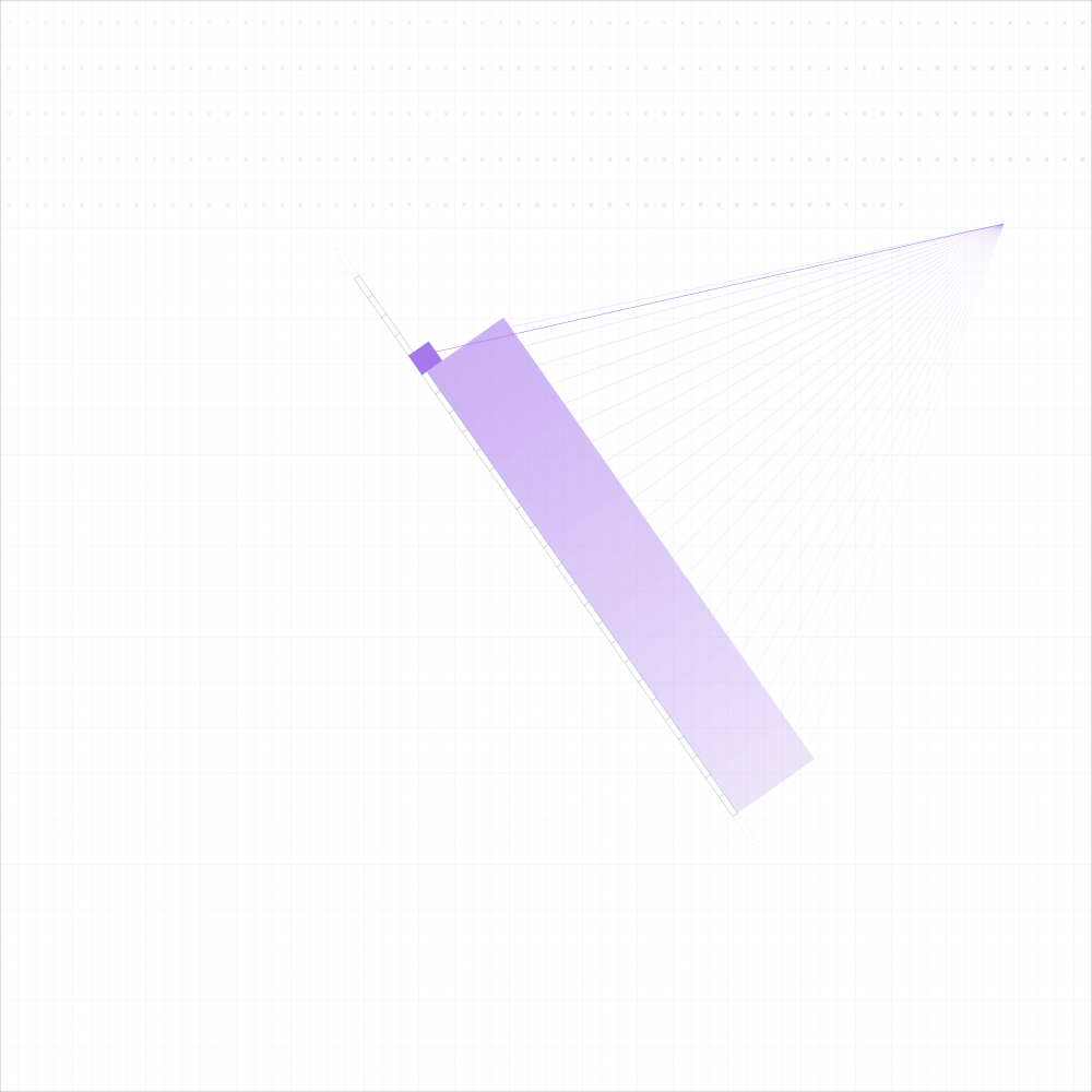
Using an algorithmic clock I made in 2019, I captured a few distinct times as single images of vector graphics. As the title suggests, I am capturing a few local times when some wars were believed to break out. I included 9 wars that happened during the 20th and 21st centuries in particular. Obviously, what’s included in this collection is far from a complete list of wars. I am not making any assumption that there is a varying degree of importance between these wars and wars that are not included. It is simply my own lack of research that prevented me from expanding the list. (It is possible that I will continue adding other images to the collection later.)
I suppose the exact account of “What time did the war begin?” is disputable. I try to refer to what’s considered to be the official time when fighting erupted. In each work’s description, you will see where I sourced the time data. For some wars, I estimated the time based on the information available.
In fact, my attempt to verify “the exact time of occurrence” is futile, considering the characteristics of war. Despite portraying the start time of each war, I want to comment that it is not one moment that leads to a conflict but it is continuous moments before and after which collectively impact the lives of people. I am against perpetual aggression, hatred and struggles that are born out of any war.
For Ukraine, Tigray, Syrian, Afghanistan, Congo Edition: 100% of the profits of the primary sale from the NFT will be donated to organizations that support the recovery of the people in the region.
(Each NFT is 1/1, Dimension: 1860 x 1860px, Scalable Vector Graphics)
I made an algorithmic art piece called Timesheet in 2019. It is a clock that is drawing the daily time (hour, minutes, seconds) along with the calendar time (month, date) and the phases of the moon. My visual inspiration were points, lines and planes which are the basics of geometry and the graphical expression.
The clock was made to pay tribute to the fact that we are given the same amount of time every single day, and thus it is equally precious. Based on this thought, an entire day is drawn as a single page, reflecting our daily time span and the boundary it gives us. Then, over this grid-paper background where daily time is passing, an additional drawing is layered indicating a larger time unit, namely the date along with the fullness of the moon, which speaks to the uniqueness of the timestamp. (To see the clock in action, click here)
The following is the logic that explains how this clock works:
Each day is represented by 60 (minutes, columns) * 24 (hours, rows) cells. A day has 60 x 24 = 1440 cells (minutes) (POSITION) If a cell has a check mark (x), it means that the minute had already passed. You lived that much today! (TEXTURE) The current minute’s cell gets filled up by the current minute’s progress. You can see the cell growing as each second ticks. (SIZE) A different color is used per hour. (HUE) Different gradation (alpha level) is used per minute. Later in the hour, a little more prominent. (VALUE)
Each month is represented by a series of cells on a line. The number of cells refers to available days (28-31) of each month (SIZE). Each cell has a bar on top, which indicates the fullness of a day. If a day has passed, you’ll see a full bar on top of the day cell. The alpha level (VALUE) for each bar changes, depending on which day of the month you are looking at. If you are in earlier days of the month, the passed days’ bar will have less prominent color (lower alpha value). Towards later days of the month, the bar will show more prominent color. The bar has the same width as the bottom grid. So, what you see for the entire passed days is a rectangle that has a color gradient. (single color’s alpha level variation)
However, “today” will always be shown with a fully saturated color. Also, if today, the bottom cell gets filled up by same color as the bar, whereas other day cells have only white filling. (HUE) As today is getting built up, you see the bar growing (SIZE).
Lines get drawn on top of each day bar, responsive to the fullness of the moon. If the moon is full, the lines are longer. If the moon gets smaller, the lines get shorter (POSITION, SIZE).
When you enter into a new month, the day bar’s color changes (HUE). The month bar (cells on a line) rotates, centered around a point (ORIENTATION). This movement is corresponding to the fullness of each month. A starting angle of each month is apart from the next month’s by TWO_PI/12 (30 degress). So, even though the full circle indicates a whole year, the speed of this angular movement differs by each monthly section. In other words, this angular movement is faster in February than in January, because the month bar has to rotate the same 30 degrees angle during a fewer number of days. We just have less time in February. Time flies.
The original clock was made during my coursework at Parsons Data Visualization Program in New York. I owe the technical guidance to Samizdat who was my then instructor. He shared his knowledge on how to work with time data in javascript. For the minting process, I reworked the original piece after fixing two bugs that I was not aware of in the original .